I've always wanted to say that.
Lets continue this breakdown of the 2008 Spider-Man game by examining the graphics of the game.
If you owned a Wii, then you know that it lacks the processing and graphical power of the bigger consoles. Once you accept this fact, Web of Shadows still looks really good! The whole city of New York is being processed and streamed, so there is no lag or loading screens as you swing from one end of the city to the other, although textures would often pop-in awkwardly.
The city is huge. Swinging from one end of Manhatten Island to the other will take a good five minutes, and that doesn't include site-seeing. Not only that, but the city morphs as the game progresses. As the invasion gets worse, more rubble appears on the streets and black symbiotic tendrils appear between buildings, which builds a sense of tension as things get worse. In addition, the transformation is seamless and gradual, rather then sudden and jerky.
The developers have done a great deal of fan-service. Readers of Marvel will see characters and locations from all across the comics, from Moon Knight and Luke Cage, to the Baxter Building and Stark Tower (with the Sentry's watchtower on top, and I didn't find that until a few hours into the game).
 |
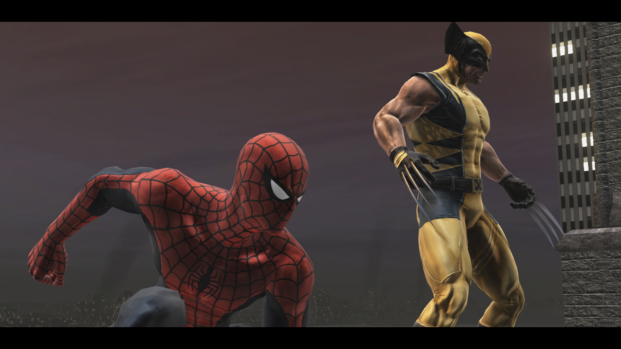
| The freaking WOLVERINE is in this game! http://www.the-nextlevel.com/media/ps3/spider-man-web-of-shadows/Spider-Man-Web-of-Shadows3.jpg |
However, the city itself does look dull. There is a big variety in buildings and locations, but they are all of a dull steel or rock colour. They don't gleam in the sun as one may expect and Spider-man isn't refelcted as he crawls over the windows of a Skyscraper. There are few citizens in the streets and
while there are lots of cars (which the Black Suit can throw) they are dull and lifeless, simply stopping when spiderman appears.
This same statement applies to the villains. Although there are a huge assortment of foes and henchmen to fight in the game, they all look roughly the same, with very little model detail. For instance, its hard to tell the difference between the grey symbiote which dies to one punch and the greyish-white symbiote which has powerful attacks and lots of health, until you've already been punched or bitten.
 |
| Oh great, more boring looking mooks http://gotps3.ru/files/_images/spider_man_web_of_shadows_445822040.jpg |
On the other hand, Spider-Man himself looks awesome. Both suits are highly detailed and variations are thrown into how Spidey jumps and twists and falls through the air as he web swings and zips across town. You can also unlock variations on the suits as you play through the game. For instance, I spent most of the game in Ben Reilly's more visually interesting Spidey suit, but there is also the Armoured Spidey and Spider-Man 2099 suits to try on.
 |
| Check out that ass. Peachy and shiny http://xbox360media.ign.com/xbox360/image/article/914/914608/spider-man-web-of-shadows-20080930094922636.jpg |
Yet, there is one big problem with the Wii version. The basic game graphics were decreased to aid the Wii's processing power, and the game is better off as a result. However, the same was not done for the in-game movies and cut-scenes. Perhaps it was just my copy, but these lagged, took some time to load and, worst of all, the sounds and dialogue were out of synch, distorted, and couldn't even be heard, ruining any immersion or understanding of the games plot. For instance, when Electro appears, the sounds was so distorted that i had no idea why he was so upset or aggressive, and the boss fight became just another arbitrary battle.
More next time. Same Spider-time, same Spider-blog
No comments:
Post a Comment